easely
PACKAGING DESIGN / BRAND IDENTITY
A conceptual menstrual brand with a 3-product family packaging design. As someone who has been menstruating for more than a decade, used a menstrual cup for the past 8 years, and recently switched over to a menstrual disc, I am passionate about sustainability when it comes to menstrual products.
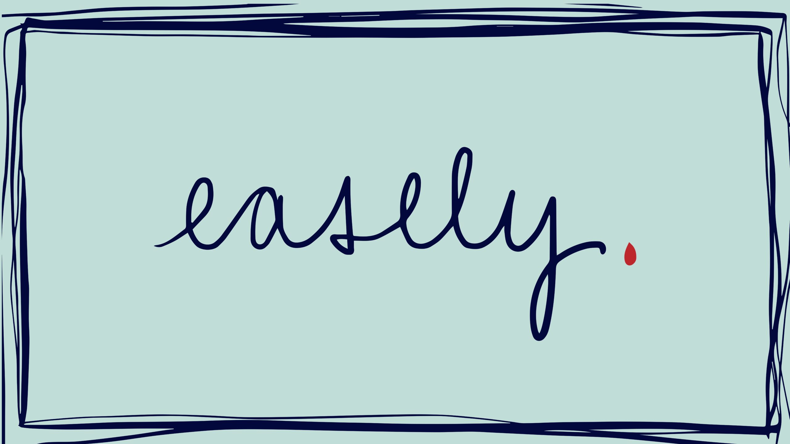
In a time of chaos in my life, ease was my focus. I was once journaling in my Leuchtturm1917 journal on a train ride when someone looked over my shoulder and asked what my writing style was. We conversed about how a new generation of people do not know how to read or write in cursive.
After scripting "easily" out, it also looked like "easely." I wanted to focus on the root "ease," especially for an experience that often happens monthly and is not usually "easy."
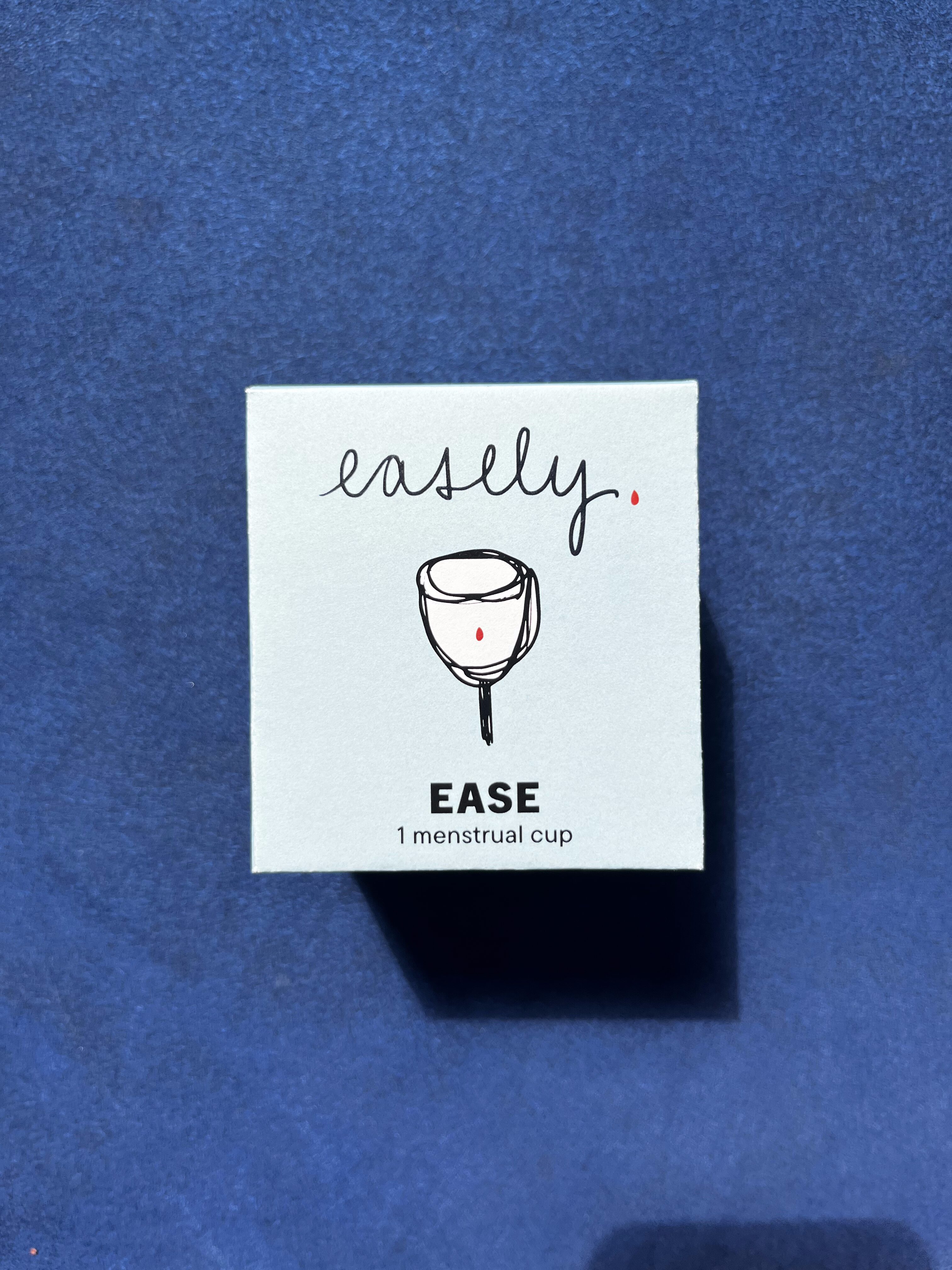
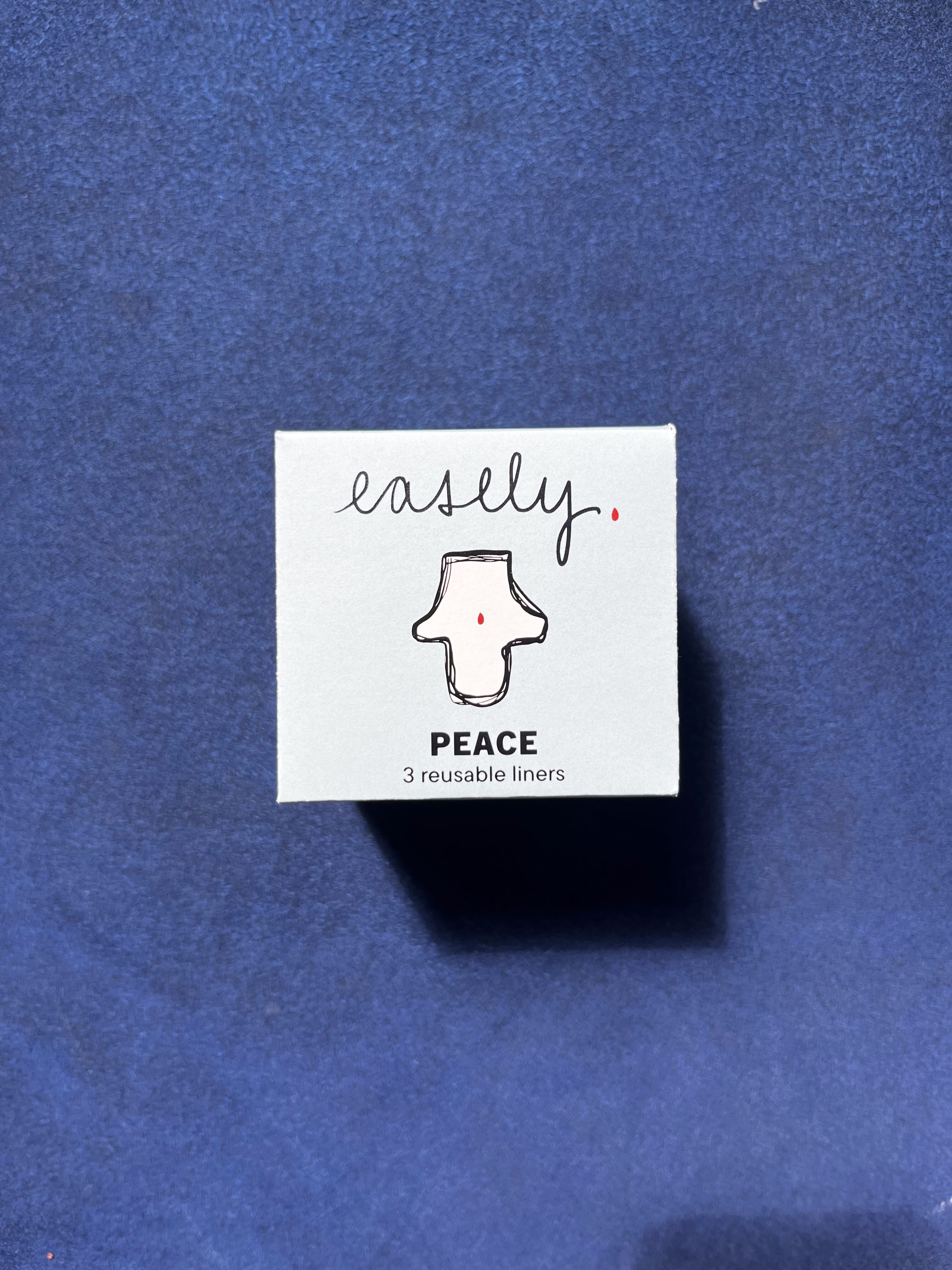

individual menstrual products: menstrual cup, menstrual liners, and menstrual disc
We were then tasked to make a shopping bag. Since I was focusing on sustainability, a reusable cloth pouch seemed like the path to go rather than designing a paper bag. With the help of an embroidery machine, I embroidered the logo onto a canvas piece of cloth, which I then sewed. After sewing, I thread a piece of ribbon, which I saved from other packaging, through to create the drawstring.
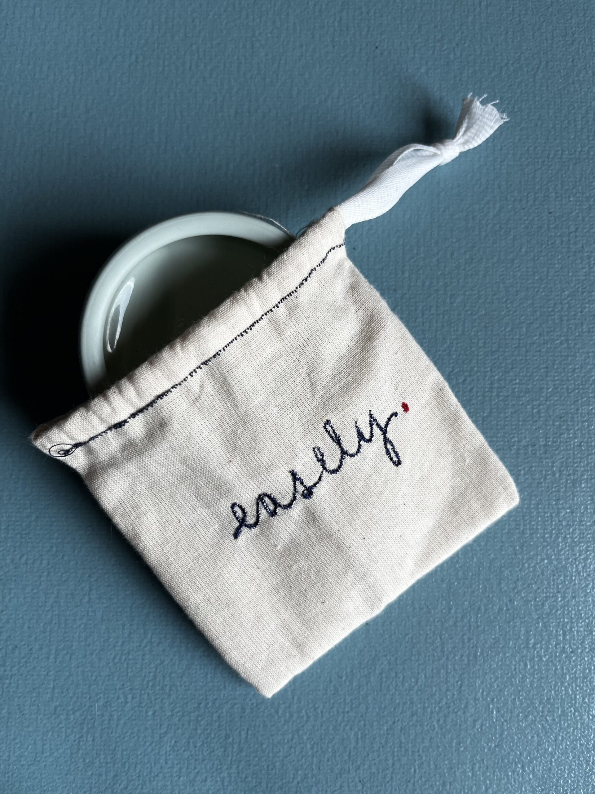
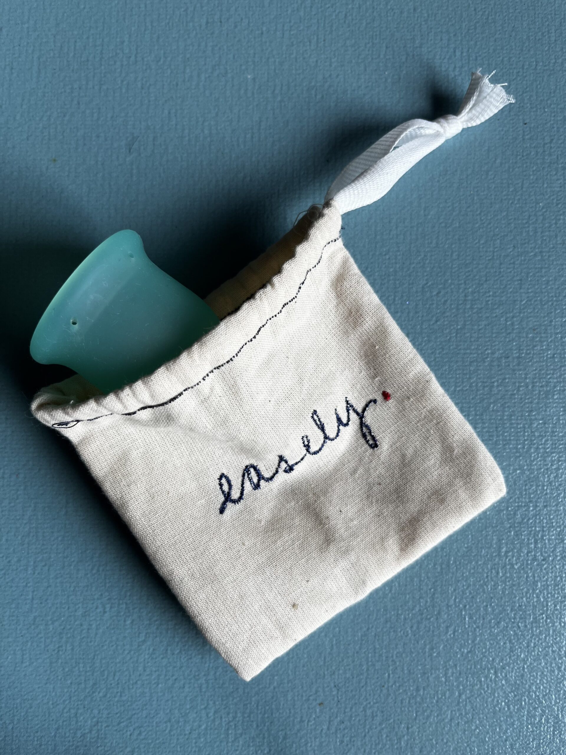
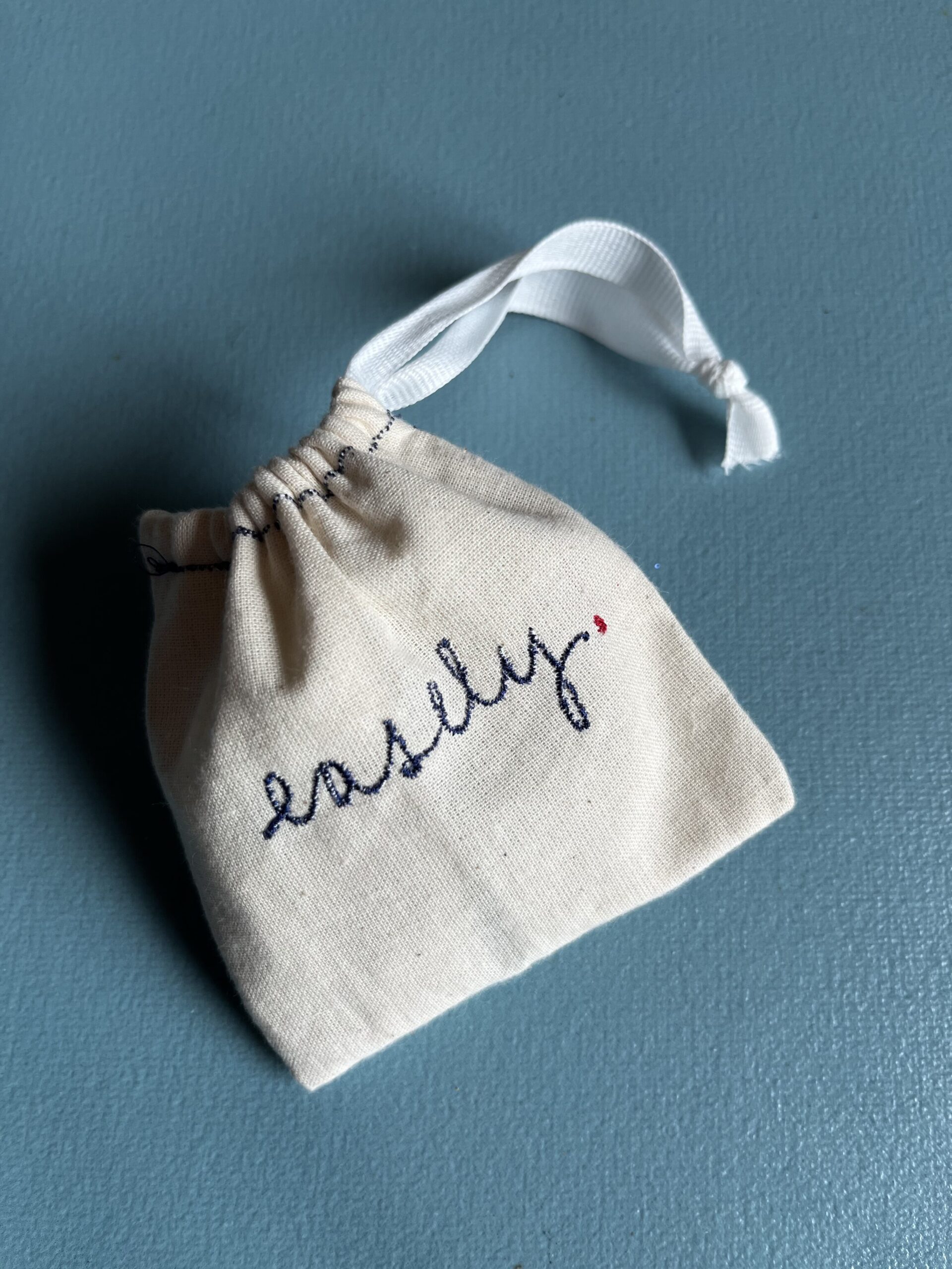
embroidered and sewed bag with disc, cup, and drawstring closed
©2025 Tina Tan. All rights reserved.